Responsive (RWD)
& Mobile Website Design
Websites promote you 24/7: No employee will do that.
― Paul Cookson
Mobile is changing the world. Today, everyone has smartphones with them, constantly communicating and looking for information. In many countries, the number of smartphones has surpassed the number of personal computers. Having a mobile-friendly website has become a critical part of having an online presence. (As quoted by Google on Webmasters blog)

The challenges we've found with a mobile and desktop website:
- Two websites to maintain plus two hosting accounts
- Duplicate content (which is discounted by some search engine companies)
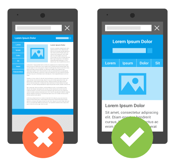
- A scaled down version for the mobile site and your customer doesn’t have all the information about you
- There is a functionality issue with the mobile phone site. It does not render correctly on a tablet showing lots of dead space on the edges. The desktop site has the same problem causing the user to have to pull and push the content.
- Many business people are on tablets, this market shouldn’t be forgotten.
To combat these problems Gruene Acres Web Design LLC has become proficient in developing “Responsive Websites”.
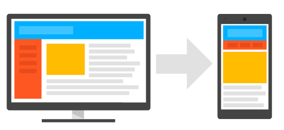
Responsive web design (RWD) is increasingly becoming one of the most often discussed and debated approaches to delivering a consistent and optimized web experience to any display, whether it’s a high-resolution tablet device, a smartphone, or a 50-inch monitor. As everything from billboards to watches becomes Internet-enabled, and device sizes and resolutions are no longer standard, many businesses and organizations with strong dependencies on a strong web presence are investing in resources to:
- Build their brand awareness & engage with mobile users
- Grow their demographics beyond the borders of a stick & mortar store using the mobile segment and relevant content
- Increase customer loyalty with quality digital experience across all devices
- Create investments in resources to produce and maintain experiences with the end users
Growth in mobility
The driving force for responsive web design!
The term mobile site has to include smartphones and tablets, especially in the global market. Adobe’s 2013 Mobile Consumer Survey finds that:
- Globally, websites are getting more traffic from tablets than smartphones.
- Internet users view 70% more pages per visit when browsing on a tablet compared to a smartphone.
- (Excerpts quoted from Adobe)
View our portfolio of design
Gruene Acres Web Design LLC works with all size clients, in a variety of industries to create content for their clients, good layout to best present the content, images and video with an SEO buzz. Contact Gruene Acres Web Design LLC information on why you should choose a responsive website design.
Redesigned Web Design
The problem is there are no simple “right” answers for most Web design questions (at least not for the important ones). What works is good, integrated design that fills a need—carefully thought out, well executed, and tested.
― Steve Krug, Don't Make Me Think: A Common Sense Approach to Web Usability
Many of our clients with good positioning in the search engine results seek to redesigned their website rather than create a new design. When your content is working you will keep costs down and still have a fresh look. Today in the world of responsive design we can make the change while incorporating new techniques of displaying content using graphs, adding interactive maps, etc.
One of the tasks Google has assigned web designers is to give credit for content when we style and design websites. This goes for our clients too. No longer can we quote or make up something and not give a source. While I was researching I came across the perfect graphic explaining Content and RWD
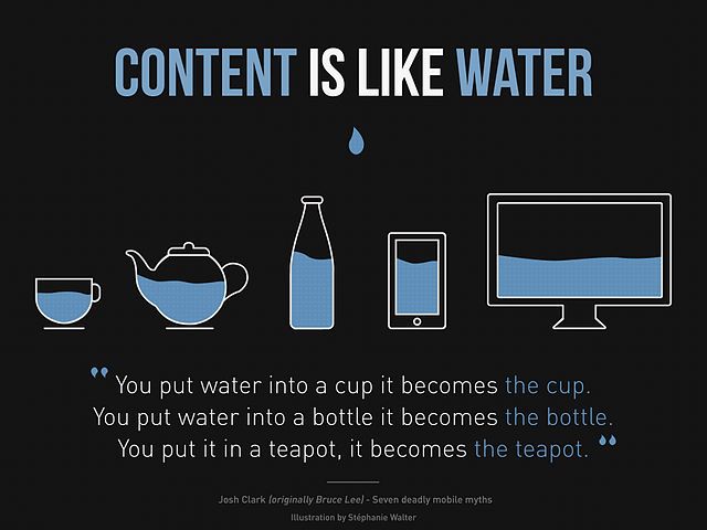 Content-is-like-water-1980" by Stéphanie Walter - http://www.inpixelitrust.fr/blog/illustration-content-is-like-water-et-traduction-responsive-webdesign-present-et-futur-de-ladaptation-mobile/. Licensed under CC BY-SA 3.0 via Commons.
Resources: Won’t you agree? The Internet and websites are continuously changing. Believe me it’s true. Want to know more about industry news or what to watch out for? Visit our resources section.